Showing posts with label Kitchen Decor. Show all posts

Sunday, April 22, 2018

Counter Stools Update


Thanks to a suggestion from The Bee Lady and others on my post about buying counter stools a while back, we purchased three stools for our counter and one for a back up.


The ladies suggested buying extras because if we lose one due to breakage, we might have a hard time finding a replacement. Their suggestions made sense so we bought the extras.


We gave the new stools a good workout recently when the four youngest grandkids were here together during spring break...


If you're a grandparent, I'm sure you've learned that superheroes don't have time to be careful with the furniture.

I would prefer stools with brown legs, but these white cushioned stools are only available with black legs at Pier 1 Imports. 

It would be easy to paint them with chalk paint, but buying a new house is in our future and the black legs might work better there.


To protect the wood floors, we added felt tabs to the bottom of these stools as we did with our other chairs and stools. 


We used the tabs that you pound in with a hammer, but first I had to remove the plastic ones that came on the stools when we purchased them. 


Luckily all it took was a Phillips-Head screwdriver and a little elbow grease.


It was more fun adding these "hammer in" new ones than removing the old ones. 


I don't know about you, but hammering something always makes me feel a lot better when I'm done!


Thanks for dropping by!


Friday, March 2, 2018

Tea Time And The $5 Bouquet


It's been cold and rainy in NE Texas this week, perfect weather for a cup of tea and some flowers to brighten the kitchen. 


I'm usually not a purple person, but the granddaughters are coming and they both love purple just like most little girls do.


The flowers weren't meant for the kitchen, but when I went to make a cup of my favorite English Breakfast tea, the room was kind of dreary due to the overcast weather. 


And it seemed I may have made the kitchen a little bland in my effort to tone down the yellowish brown cabinets. 


All the brown, black and white of the kitchen seemed to need a pick-me-up. 


It was then I remembered my $5 worth of flowers I'd just bought in bright cheerful colors of purple and yellow.


The pig seems happy with his cheerful bouquet. He didn't seem to care that they came from The Dollar Store and were only a dollar a piece for each bunch.


I'm trying to think of something witty for the chalkboard, but all I can come up with so far is "Happy Easter!"


Yeah, I know that's not too original...in fact it sounds exactly like "Happy 4th!" which is what I got stuck on for 2 or 3 Julys in a row!


I'm open to suggestions for a kicky phrase. Meanwhile, I plan to repaint the little chalkboard black to get rid of the residue of chalk.


Sharing my tea post this week at the Friend's Sharing Tea party at Bernideen's. I hope you'll join me there.


Thanks for dropping by!


Friday, January 26, 2018

Painting The Kitchen Wall Section


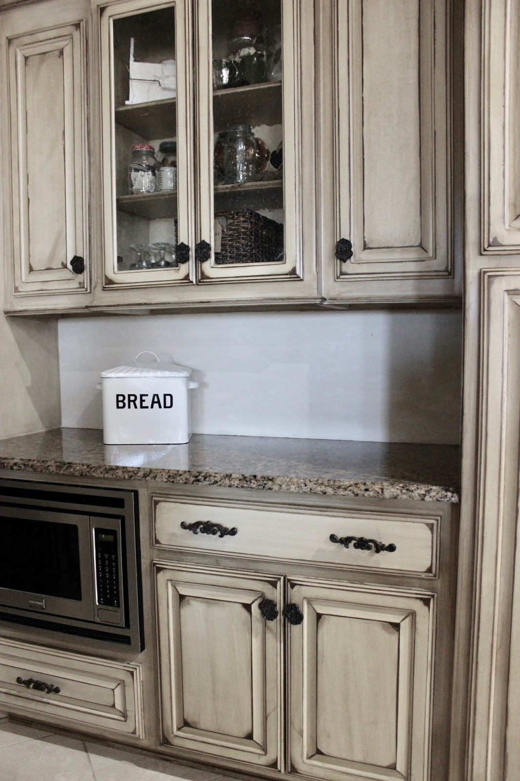
Our kitchen cabinets have a distressed finish that was done by the builder 7 years ago. 

Paint Finish Appears More Yellow Over Time

I'm a big fan of the distressed look on furniture and cabinets, but over the years our cabinets have yellowed with some sections worst than others.

To take away the yellowish hue, I decided to start with a small section of wall below these glass cabinets. 


This wall section was originally painted with the same finish as the cabinets and is one of the yellowest parts of the kitchen. 

With the under-counter lights turned on, the wall finish looked really ugly yellow next to the brown granite countertop.


Several Shades of White For Comparison

I've planned for over a year to add some bead-board and corbels to the wall area like shown in this picture from a 2016 issue of Cottage magazine...


Plan: Add Wood Like This 2016 Issue Cottage Magazine


2016 Issue Is The Best Ever Of Cottage Magazine!

I chose the creamier white shade from my samples and painted two coats on the wall section. I used a bright-white bread box to show the creamier white on the wall compared to a really true white color.


Photo Filtered To Show How The Cabinets Would Look With Less Yellow


I put some white dish items and a black chalkboard next to the wall section to see how the cream color on the wall looked against black and white. 

I didn't really like the creamy white compared to the bright white and black. The creamy white just kind of faded away...


Looking at all the white dishes with the black chalkboard made me realize the gingery brown color of the cabinets looks better contrasted with bright white and black like the dish towel laying on the counter.

I actually bought this dish towel a few years ago to use as an inspiration piece for the kitchen.  

I guess I got lost in my disease called "Paint Decision Trauma" and forgot about my inspiration piece! 

I'm scratching the creamy-white paint color and sticking with the colors in the dish towel as I think this is a better option. Maybe.


Dish Towel Will Be My Inspiration Piece

I'll be painting more samples on the wall section...first some white paint, then some black paint...before adding bead-board.  

I want to know exactly what color I want to paint the bead-board before we put it up as I only want to paint the bead-board once!

Won't you join me at the Keep-In-Touch party at Let's Add Sprinkles, the Feathered Nest Friday party at French Country Cottage and Best of the Weekend at Ms Toody Goo Shoes

I sure hope I don't get any more paint color ideas over at these parties.


Thanks for dropping by!


Thursday, October 5, 2017

You Can't Always Get What You Want


Bless my heart...I was on Pinterest last week looking at one thing and ended up at another. You know that 'ole rabbit hole that's easy to get sucked into?

Anyway, I saw some beautiful table settings, which of course made me think to myself:  "Sugar, you need some of those plates!"


I went to the website to see how much a set would be. The price was $298, which was OK by me...I just wanted to check how many there were in the set. 

My hopes of setting my future fancied-up table were dashed when I realized they wanted $298 a plate! COME ON! With tax that would be almost $3000 for just a set of 8 plates. 


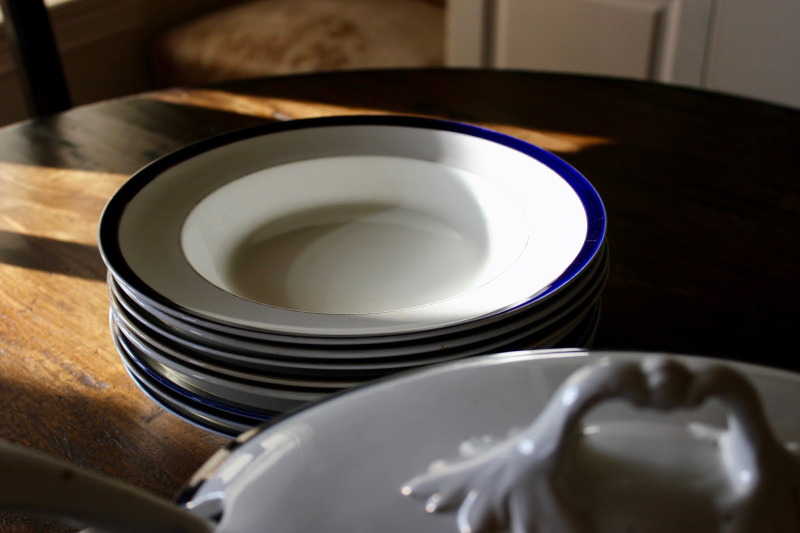
A few days later, I went to a Vintage Market Days event where I spotted a lovely soup tureen, with a ladle, and a price tag of $19. 


As I was gleefully paying for the soup tureen, the vendor asked if I noticed the matching bowls on the same shelf? 

I told her I didn't really need bowls, but when she said they were $2 apiece...well, back I went for them!


Sadly, when she showed me the last piece she had, a matching platter for $19, I was stupid silly enough to pass it up! I've been kicking myself ever since.


To tell you the truth, I like the blue band a lot better than the green band around that $298 one. I figure I can always throw some acorns around the table to bring in that woodsy feel!


Thanks for dropping by!


Joining the party here:
Talk Of The Town Party
Share Your Cup 


Saturday, April 22, 2017

Three Things I Couldn't Pass Up


Back a few weeks, I went to an indoor flea market. I bought the cow in my last post and three other things. 
One lesson reinforced that day...take a quick walk around the space and see what's available before you start buying, otherwise you'll see things you love better, but won't have any money left *sigh*... But I'll bet you already knew that, right? 

Here's the three things I bought in addition to the cow:

1. This sweet painted tote box with old rusty hinges and clasps holding the end pieces together due to cracks. Perfectly imperfect!


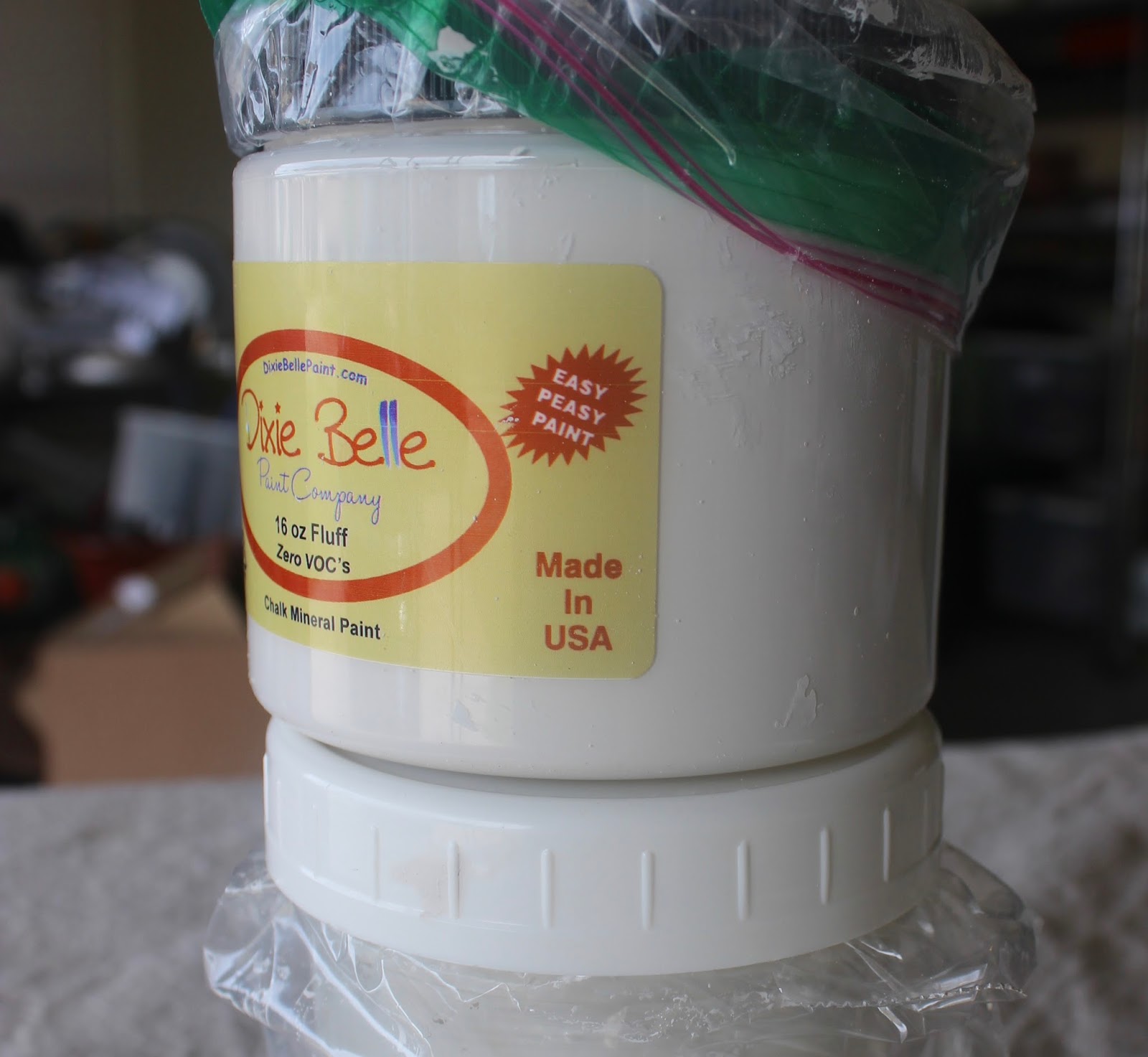
2. Some products from Dixie Belle Paint in two shades of off-white (like I didn't already have enuf white)... 
The demo lady did a good job of selling people on her product, and I must say it goes on as easy and smoothly as she said! 
 The top one is Drop Cloth. It's a little darker than Fluff, the bottom one. I bought a larger Fluff as I think it's a color I will use more.
It says "easy peasy paint" in the top left corner of its label. I have to agree! I painted a few things with it. I think I'm going to like it. It's made with minerals that give it a little more shine than most other chalk paints. 

So many good products out there...It's hard to stick with just one!

3. A black and brownish-taupe sign for the kitchen. 
I love the unique shape of the wood and the texture and colors. 


I thought it would be perfect for the vent hood over the stove in our kitchen. I'm trying to add black and white to the taupe-y color in there. None of my pictures came out a true color. Please use your imagination here. Having no windows in the kitchen makes it hard to take a decent picture.

Here's the vent hood. I plan to hang the sign right in the middle of the scrolly thing on top.
You'll have to imagine how the sign will look when it's hung up there. I tried to get Wild Bill to stand there on tippy toes and hold the sign up for me, but you know how guys are.

Joining the party at Amaze Me Monday and Sundays At Home Party at Little Farmstead.  Hope you'll click on over and join in.


Thanks for dropping by!